Earthen Tea Company
To many, tea is more than just a drink; it is a meditative ritual. Earthen Tea Company honors this tradition while blending graphic design with the rhythm of ceramics. Through design and ceramics, the fictional company combines rhythm, form, and tradition through earthy tones and natural materials. The company balances digital and tactile art with traditional and modern aesthetics, inviting viewers to pause and find balance in the everyday.
For my senior BFA exhibition, I sought to combine my newfound passion for ceramics with my design skills. One evening, while driving through Land Between the Lakes, I found the connection I was searching for: nature. I’ve always been drawn to it, and it felt like the perfect link between clay, sourced from the earth, and design, which connects people across the Globe. Earthen Tea Company was born from this idea, drawing inspiration from natural materials, the leafiness of tea, and sustainable practices to create a modern tea experience.
The Logo
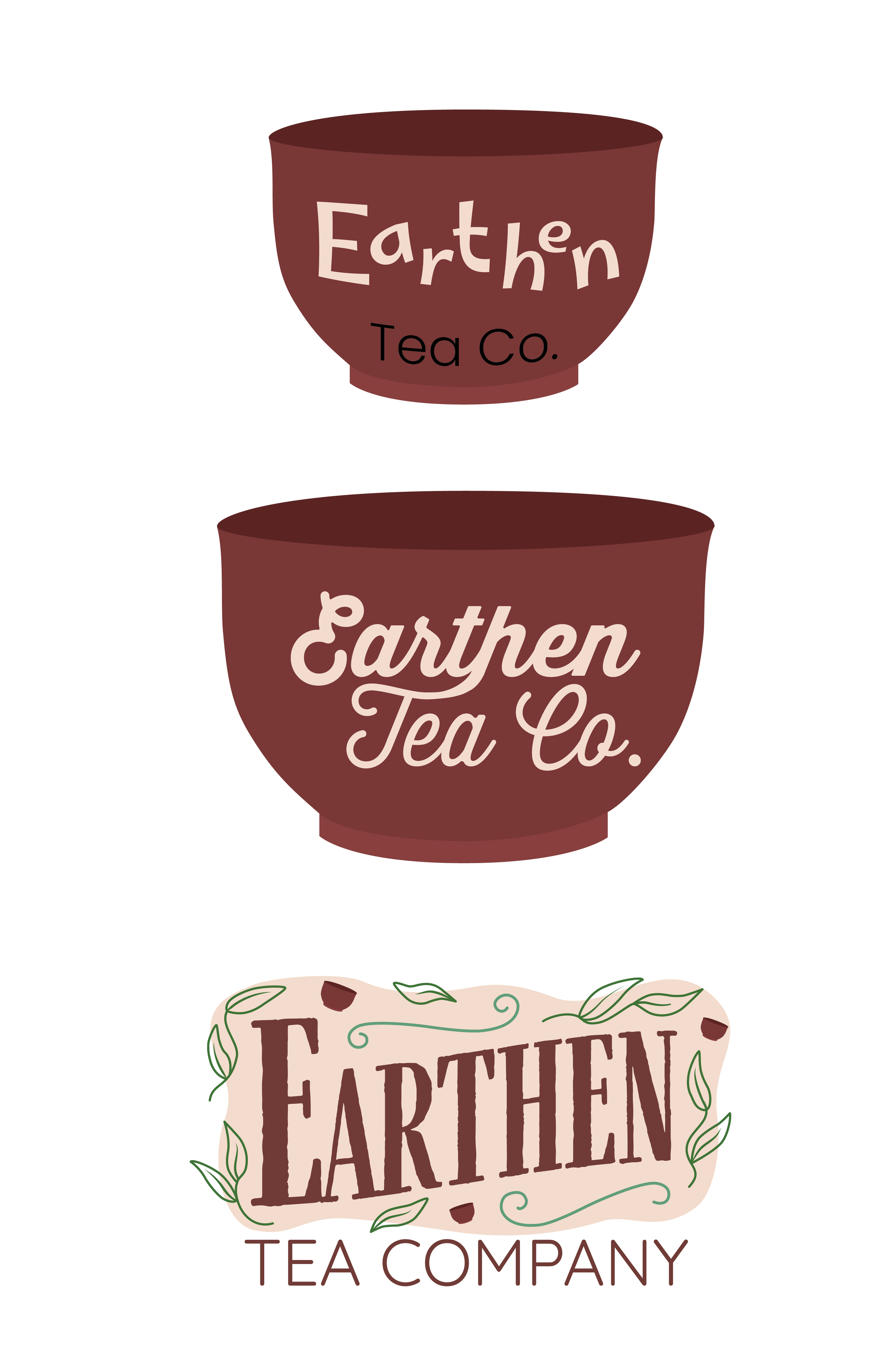
The first set of images illustrates the brand's origins. Initially, I designed a logo centered around a tea bowl, echoing the ones I planned to make. But I quickly realized I was boxing myself in by focusing too heavily on one particular element. I shifted my focus to typography and discovered Farmhand, a textured, Western-style font. After experimenting with different layouts and elements, I hand-traced the logotype to adjust the serifs and spacing, achieving a hand-touched feel. I later replaced the tea bowl with leaves for greater clarity. The changing of these elements later led to the final logo, which blends natural imagery with a fluid, approachable identity.


The Tea Canisters
One of the key elements in the branding of Earthen Tea Company is the tea canisters themselves. Before the final logo was developed, the canisters originally featured an all-over pattern with a square label and were designed for a 16-oz container of tea sachets. After purchasing the final 6-oz canisters, the design was scaled down to fit the smaller format. The visual direction also began to evolve as I drew inspiration from the packaging work of Farm Design and Butterfly Cannon. The updated layout introduced a burst of leaves and flowers that emerged from behind the label, extending to the edges of the canister and incorporating rounded corners that echoed the curves of the logo. This composition eventually became the foundation for the final design. The second stage of branding the canisters was selecting the right materials. I tested everything from standard presentation paper to various weights and tones of Speckletone French Paper and vellum. After extensive experimentation, I settled on a combination of 80lb Speckletone French Paper for the wrap and 17lb vellum for the label. Minor design adjustments were made throughout the process to suit these materials. Unfortunately, printer issues arose toward the end of production, resulting in slight inconsistencies.


Additional Packaging
Once the tea canisters were finalized, I began designing additional packaging elements, most notably, the box that would be used for shipping or display. I wanted this piece to visually connect with the canisters, creating a cohesive unboxing experience. The box design incorporated the leaf motifs found on the canisters, framing the logo and reinforcing the organic, calming tone of the brand. I also included short sayings and phrases that reflect Earthen Tea Company’s values, helping to build a deeper emotional connection with the customer while maintaining a clean and natural aesthetic.


Instagram Posts
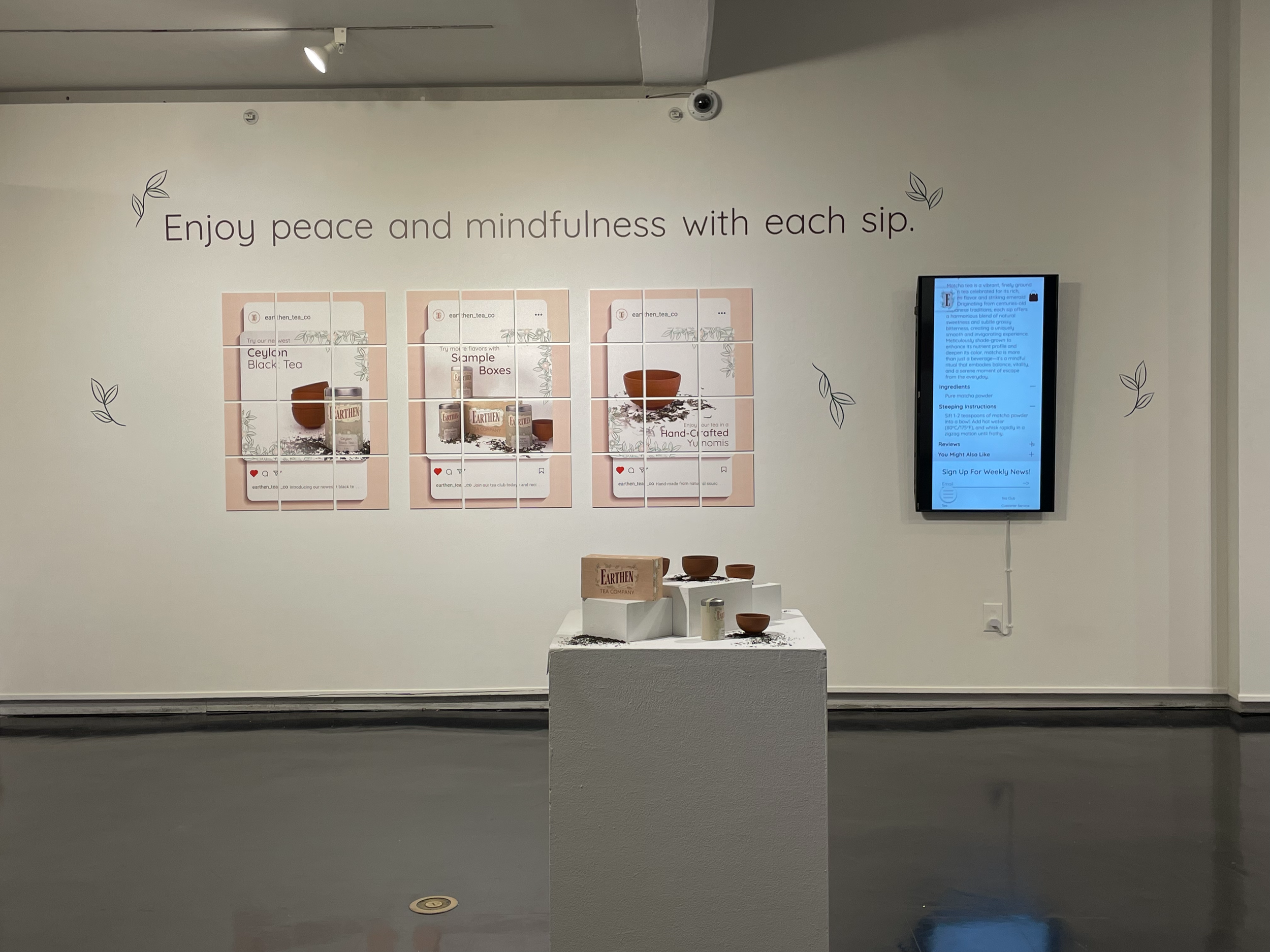
Another element I created for Earthen was a set of Instagram posts to accompany the final exhibition. These posts evolved alongside the brand, beginning as conceptual mockups that explored packaging ideas before I had the final canisters. Early versions introduced the concept of the shipping box and experimented with new materials. Ultimately, the final Instagram posts were printed and tiled due to the large-format printer being unavailable. Despite the extra effort, the tiled presentation brought more visual interest and dimension to the show, ultimately making the display more engaging than it would have been with traditional large posters.


The Final Exhibition
The Earthen Tea Company exhibition was the culmination of months of design, research, and hands-on experimentation. Blending digital design with handmade elements, the project pushed me to think holistically about branding, from logo development and packaging to website layout, social media presence, and the creation of over 50 earthenware tea bowls. The exhibition space was designed to feel immersive and calming, inviting guests to engage with the brand through a physical tea bar and product displays. This project was a valuable learning experience that challenged my technical skills, deepened my understanding of materiality, and taught me how to adapt creatively when things didn’t go as planned. It ultimately reinforced my passion for thoughtful, tactile design that connects people to everyday rituals.